T.O.F.U. #13 | Cover Reveal
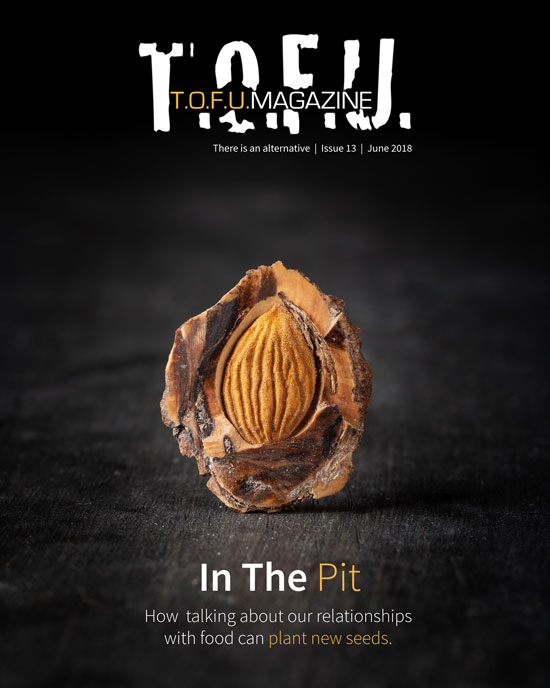
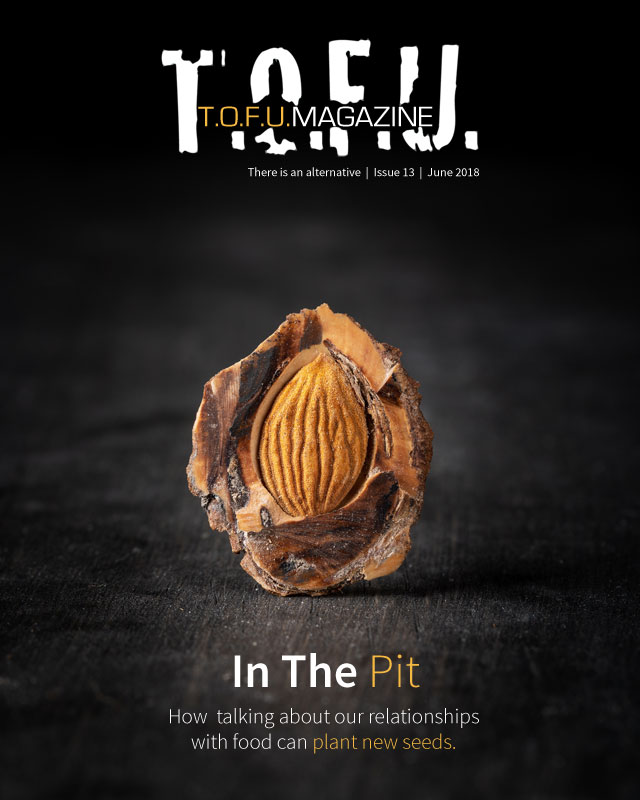
Last night, I was sent a draft of the final illustration for the upcoming issue, which means the whole thing is almost done! With that in mind, I thought it might be a good idea to finally show you one visual piece for the issue that’s been done for a little while now: the cover.
Why does the cover look the way it does? Since you asked, I’ll be happy to explain! 😉
The Concept
I chose a peach pit for a number of reasons. Obviously, it relates to food and eating. However, specifically using a pit goes beyond that. First, many may not consider it as visually appealing as a peach. So, in a way, it represents the ugly truth beneath. In regard to some eating disorders (EDs), this could relate to either the way someone sees themselves or it could be the fact that suffering with an ED can often be ignored by others who see weight loss and thinness as great, no matter the reason. Also, peach pits contain toxins that can prove fatal in high doses. For some, especially those in the “clean-eating†community, all that’s needed is one exposeÌ on the dangers of common fruit to eliminate them from their plate and Instagram accounts.
On a positive note, the pit is also a seed. Through love, it can grow to be something beautiful. Hopefully, thanks to the contributions of the authors and artists, the upcoming issue will prove to be a source of love and growth, both within the community and yourself.
Photo Credit: Devon Crosby

