T.O.F.U. #12 | The Art Process With Designer Angie Carlucci
For the last two issues, I’ve highlighted the artists involved in creating the illustrations, but I have yet to talk about the process that happens when going from concept to creation. Now, thanks to the cooperation of one of the graphic designers I worked with for T.O.F.U. #12, I’ve decided to finally do just that.
Obviously, the process involved with creating the artwork for each issue has changed over time (Seriously, have you seen the first few issues? They’re in black and white!), but the following provides a good example of just how things have happened ever since I started publishing the magazine with print in mind.
So, without further adieu, here’s how an illustration finds its way into the pages of T.O.F.U. Magazine.
Finding the Artist
Over the years, T.O.F.U. has been lucky enough to have a number of talented vegans involved with the creation of each issue, and, in some cases, their artistic fingerprints can still be found on the pages today. However, after the printing of The Book of T.O.F.U., I decided to open up the illustration portion of the magazine a little more, and so I sought a number of new illustrators and designers to help make the pages beautiful.
One of the people who was kind enough to take me up on my offer to be involved was Angie Carlucci. A graphic designer from Toronto, Ontario, Canada, I found Angie’s work through a simple Google search for vegan designers. Of course, once I found it, I knew I wanted to ask her to be involved.
Finding the Right Concept(s)
Soon after Angie came onboard, and once my laptop was back from the shop (SIGH), we started talking about concepts that could work for Sarah Rice’s article, Taking What I Need. Although I typically offer ideas to the artist to help minimize the personal time they have to put into the work, this time around I left it open to Angie, and she responded with a number of great ideas.
Angie: I couldn’t wait to get started on this piece and had four concepts in particular that I wanted to bounce off of Ryan. Visually, I really wanted to use a pill as either a shape to house other elements in or as a focal point of the piece.
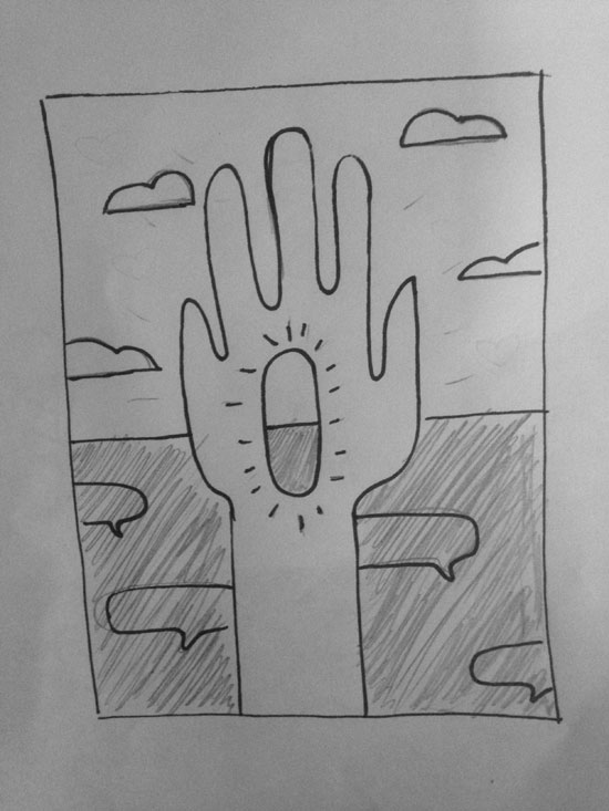
For the first concept, I liked the idea of a hand holding a pill in the centre of the frame and using the horizontal line on the pill to separate the background into two different sections (sort of a light vs dark idea). The bottom half would reflect, in an abstract way, some of the negative/ableist remarks Sarah has experienced, and the top section would show the positivity and progress that the medication has brought to her life.
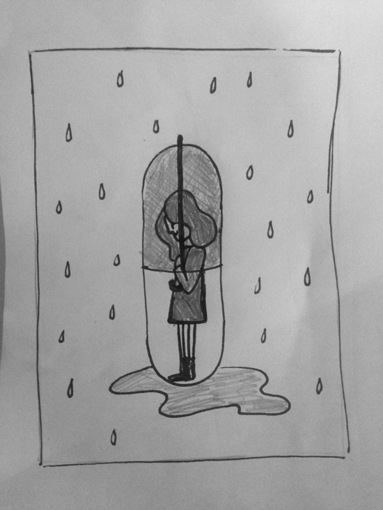
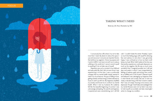
The second concept plays with the idea of the pill as shelter from falling rain, and that within this shelter Sarah is healing and happy.
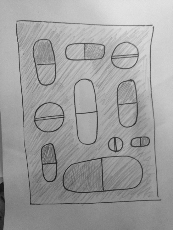
The third option was a little less heavy on concept and more of just a beautiful visual. It would have a variety of pills of various shapes and sizes with all, except for the pill in the centre, in a palette of blues/greens, and the centre pill highlighted in white/red. The idea for this is that Sarah has chosen a way of healing that includes a medication that may not necessarily be completely vegan but was the right choice for her at this time.
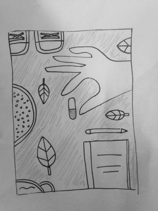
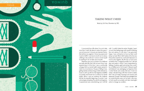
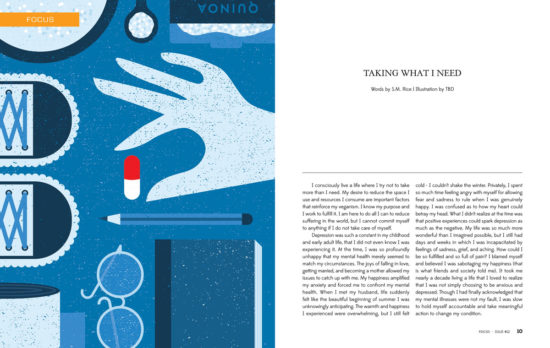
The final option was inspired by what Sarah was saying about the advice she was getting from others about ‘self-care’. A hand reaches for a pill in the centre as the focal point, and is surrounded by some of the items mentioned in the article that people had recommended to Sarah (ex. a bowl of quinoa, book from a book club, hiking boots etc.).
Making a Choice
Of course, we ultimately had to narrow it down. Again, this is something I’m usually good at doing, but I found myself unable to choose between two of them (#2 and #4), so Angie decided to flush out both a little more before we made the final decision.
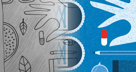
With both concepts mocked up, we ultimately found ourselves liking the fourth idea more due to how much of the article was represented within the image. From the bowl of quinoa to a pair of hiking boots, the hand is clearly making a choice for what works for its owner, and Sarah’s piece was ultimately about doing the same thing.
Angie: After playing around with a couple colour palette options we landed on this cool-toned, more subdued blue palette with the pop of the red and white pill. I felt this palette paired well with some of the heavier topics Sarah had delved into in her article and helped the pill stand out as the focal point. Texture and distressing were added as a final touch to give the piece some visual interest and grit.
An Artist’s Work is Never Done
Throughout the whole process, Angie was both professional and friendly, which made things a lot easier on my end as I was juggling working with her and over a dozen other people to get the issue together. Thanks to her work ethic, as well as its quality, I ended up asking Angie to do a second piece for the issue. To see it, as well as work from several other illustrators, you can download T.O.F.U. #12 for whatever price you want to pay through the online store here.
If you’re interested in learning more about Angie, or working with her on a project, please visit her website.

